Introduction: Small Tools, Big Feeling
Leopard-era utilities became popular because they solved small, visible annoyances at exactly the moment Mac users cared deeply about how OS X looked and behaved.
That matters. The appeal was not just nostalgia, novelty, or the old freeware habit of downloading anything with a good icon. It was the combination of visual polish, low-risk experimentation, and immediate payoff — the kind of change you could see before the coffee cooled.
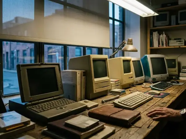
The useful window here is OS X Leopard and its surrounding late Tiger-to-early Snow Leopard period, roughly the two years between October 2007 and August 2009. Dock tweaks, Dashboard widgets, icon packs, screensavers, menu extras, and appearance utilities all lived in that space. They were small enough to try after dinner, but visible enough to make the Mac feel newly yours.
This is the part that gets flattened in memory. People often talk about the era as if it were only a pile of downloads. It was more personal than that. A glossy icon, a different Dock shelf, a system meter tucked into Dashboard: these were tiny acts of authorship.
Leopard Made Customization Feel Safe
Leopard had a strong visual identity, and that identity trained users to notice details. The reflective Dock, translucent menu bar, glossy icons, Stacks, Spaces, and Dashboard all made the desktop feel more designed than assembled.
Once the interface became that coherent, small deviations stood out. A slightly different Dock indicator no longer looked like clutter; it looked like a choice. A swapped folder icon could carry real visual weight because Leopard supported icon assets scaled up to 512x512 pixels. Icons were no longer tiny labels for files. They were objects on the desk.
The move toward a unified gray interface and translucent menu bars also made desktop real estate feel more intentional. Users were not just launching apps. They were arranging a visible environment that followed them through the day.
Why the light touch mattered
The utilities that spread best did not try to replace OS X. They modified familiar surfaces: the Dock, menu bar, Dashboard, icons, screensaver pane, or a preference Apple had left tucked away.

That distinction is important. A deep system hack asked for trust before showing value. A Dock indicator utility showed value first. If the result looked wrong, the user could switch it back, restore an icon, or remove the widget. The risk felt bounded.
Leopard’s polish did not kill customization. It made users more selective about it.
The Dock Was the Perfect Target
I still start Dock questions with one test: can the user judge the change in five seconds?
The Leopard Dock passed that test better than almost anything else. It was always visible, emotionally charged, and easy to compare before and after. People had opinions about the 3D glass shelf because they stared at it all day.
Field experience revealed that lightweight Dock adjustments were often easier to support than full theming engines. Deep theming could collide with updates or cause stability problems. A Dock tweak, by contrast, usually touched a preference, an indicator asset, or a predictable file path.
The common Dock edits
- Switching the Leopard Dock from the 3D glass shelf to a flatter 2D shelf.
- Changing running-app indicators so open apps were easier to spot.
- Adding spacer tiles to separate work apps, creative apps, and utilities.
- Adjusting hidden app behavior so minimized or hidden windows were clearer.
- Tuning Stacks so downloads, documents, and projects felt less messy.
- Replacing application icons to make the Dock match a theme or workflow.
Some utilities were little more than friendly wrappers around commands. The famous kind toggled preferences such as no-glass -boolean YES to flatten the 3D Dock into a 2D shelf. That sounds minor until you remember how much of Leopard’s personality lived on that strip of pixels.
The Dock spread these tools because one change could make the whole Mac feel more personal without asking the user to understand Terminal, property lists, or resource folders.
Widgets, Icons, and Screensavers Turned the Mac Into a Workshop
The Dock was the front door, but it was not the whole house. Dashboard widgets, icon sets, menu-bar helpers, cursor effects, and screensaver collections turned the Mac into a small workshop for visual and workflow experiments.
A beginner might start with a weather widget. Then came a sticky note, a clock, a system meter, a calendar, and perhaps one novelty mini-app that served no practical purpose except making the machine feel alive. That progression was natural because each step asked for very little commitment.
Dashboard widgets were especially well suited to the period’s appetite for glanceable tools. They were packaged as .wdgt bundles and built with standard web technologies. Many active instances used less than about 15MB of RAM, which kept experimentation within ordinary home-user expectations for the time.
Low stakes changed user behavior
Widgets and screensavers encouraged play because most problems stayed cosmetic. A bad widget could be removed. A loud screensaver could be replaced. A dull icon set could be abandoned.
That did not make every utility well built. It made the learning curve forgiving.
Advanced users got something else from the same ecosystem: a gentle path into how OS X stored preferences, bundles, assets, and user-level configuration. The small tool was often the first clue that the operating system had seams.
Distribution Made Tiny Software Feel Collectible
Leopard-era utility culture depended on how software moved around. Download sites, personal blogs, forums, compressed disk images, ReadMe notes, and version-specific compatibility warnings gave small tools a sense of place.
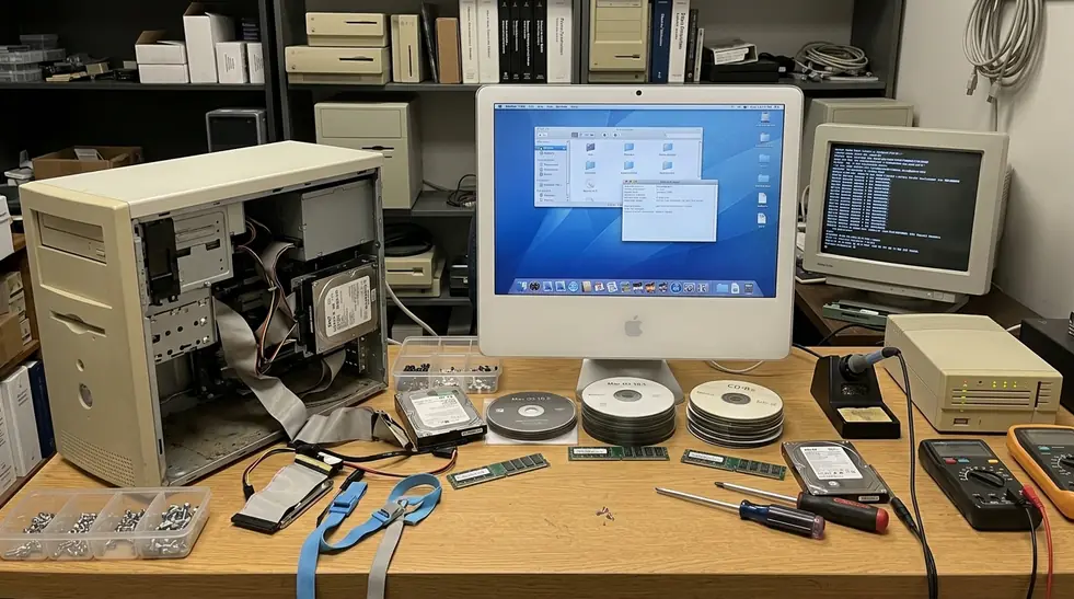
A typical download might be 500KB to 3MB, distributed as a compressed DMG containing one executable and a plain-text ReadMe. That was part of the charm. You could download it, mount it, test it, archive it, and recommend it without building a full software-management ritual around it.
Custom disk image backgrounds and stylized installation windows did more than decorate the process. They made a tiny preference toggle feel cared for. A utility that changed one Dock setting might arrive in a disk image that looked like a miniature storefront.
Recommendation: When preserving these utilities today, keep the original .dmg file with a matching SHA-1 checksum. That gives future testing a cleaner starting point and helps detect bit rot or tampered mirrors.
The pre-Mac App Store environment also gave independent authors room to publish strange, narrow tools. Donationware, freeware, and niche utilities could survive because they did not need to fit a marketplace category. A blog post and a working download link were enough.
That collectibility changed how people talked about software. Users did not only ask, “Does it work?” They asked, “Do you have the version that works on 10.5.8?”
Counterargument: Were They Just Skins?
The skeptical view is fair: many Leopard-era utilities were superficial, fragile, or unnecessary. Some broke after point releases. Some changed files that Apple replaced during updates. Some offered little more than a different color, a shinier icon, or a preference Apple could have exposed itself.
Point-release updates frequently overwrote modified system resource files, which meant users had to reapply visual tweaks after routine patches. Anyone who maintained a customized Leopard machine remembers that small sigh after an update reset the look of something that had finally felt settled.
Risk Factor: System updates overwriting modified resource files was not rare enough to ignore. If a utility changed assets rather than preferences, it needed a backup path and a clear uninstall method.
The answer is experiential
Calling these tools “just skins” misses how the Mac earned attachment. OS X’s appeal was partly experiential: speed, elegance, coherence, and the feeling that the machine responded to taste as well as instruction.
Surface-level tools mattered because surfaces are where people work. A clearer running-app indicator could reduce Dock scanning. A distinctive icon could make a favorite app easier to spot. A menu extra could expose a hidden system behavior without opening System Preferences.
That is usability, even when it arrives wearing a prettier coat.
This is also where Apple’s design culture matters. The Apple Human Interface Guidelines framed consistency and clarity as practical virtues, and Leopard users felt those virtues every time a third-party utility either respected the system or fought it.
Scope and Limitations of This View
This article is not claiming every Leopard utility was stable, safe, or historically significant. The argument is narrower: common visual and workflow utilities around OS X 10.5 became culturally meaningful because they made customization approachable.
The working compatibility range here runs from OS X 10.4.11 through 10.6.8. That includes the late Tiger lead-in, Leopard proper, and the early Snow Leopard period where many tools still carried Leopard-era assumptions.
It does not include kernel extensions, piracy tools, or enterprise administration software. Kernel-level modifications required reboots and carried a higher risk of kernel panics, which belongs to a different category of trust and troubleshooting.
Modern testing is not the same as period use
Virtualization requirements for 32-bit legacy binaries shape what we can verify now. Many archived downloads rely on 32-bit architectures or legacy universal binaries that cannot run natively on modern operating systems without dedicated virtualization software.
Memory of the era is also shaped by surviving archives and enthusiast communities. Within the surviving utility trail, it is safer to discuss patterns than exact adoption numbers.
That restraint keeps the story useful. The point is not to crown one utility as definitive. The point is to understand why so many small ones felt worth keeping.
Takeaways: Smallness Was the Feature
The popularity of Leopard-era utilities came from their smallness: narrow purpose, fast payoff, visible results, and easy reversibility.
The best of them translated hidden system flexibility into safe, understandable choices. They took a preference, a bundle, a file path, or a buried behavior and made it legible to someone who simply wanted their Mac to feel right.
That is the memorable line for the whole period: these tools made the Mac feel authored by its owner without making the owner become a developer.
Critical Insight: The best utilities translated hidden system flexibility into safe, understandable choices.
Leopard made the desktop feel polished enough to care about. Tiny utilities gave users permission to care in public, one Dock shelf, widget, icon, or screensaver at a time.

Discussion
Share your thoughts.
Write a Comment