
What's Inside
- Why a plain Dock still belongs on Tiger and Leopard desktops
- How Aqua already carries the visual weight
- Where readability should outrank dense theming
- Which small nostalgic edits still hold up
- How to test legacy Dock utilities without turning one tweak into an afternoon repair
- A restrained Leopard Dock recipe that keeps the period feel intact
Plain Does Not Mean Untouched
A quiet Dock often survives better on a classic OS X desktop than a fully skinned one, not because customization is wrong, but because Tiger and Leopard already arrive with a strong visual memory baked in.
I learned this while restoring a Leopard workstation that had been dressed in a late-2000s dark theme: black shelf, black wallpaper, black indicator dots, and a set of monochrome replacement icons. The screenshot looked deliberate. The machine, in use, felt slower than it was because every launch, badge, and minimized window took a second longer to read.
Plain, in this context, does not mean factory-default purity. It means restrained choices around Dock size, position, magnification, running indicators, icon swaps, and wallpaper harmony. A plain Dock may still be customized. It simply refuses to become the loudest object on the screen.
What counts as restrained
On Tiger, the default 2D Dock background has a flatness that handles small icon changes well. On Leopard, the 3D glass shelf is more assertive, so it asks for more restraint elsewhere. Tiger-era icons also have a native ceiling of 128-by-128 pixels, which matters when a theme expects modern high-resolution artwork.
Critical Insight: The best classic Dock does not erase the system style. It edits around it.
For most Tiger and Leopard users, the practical goal is charm without glare. The Dock should feel like part of the room, not a neon sign taped to the desk.
The Aqua Era Already Has a Visual Language
Tiger and Leopard are not blank canvases. Translucent menus, glossy icons, pinstripes, shadows, brushed metal Finder windows, and Leopard's glass shelf all speak the same broad Aqua dialect.
That is why heavy Dock skins often age badly. They do not sit alone; they sit under the menu bar, beside Finder windows, against a wallpaper, and beneath app icons that were designed for a different material language. A Dock that looks exciting in a cropped screenshot can feel pasted on when the full desktop is visible.
Plain versus themed in actual use
A plain Dock lets the rest of OS X breathe. The icon artwork keeps its color. The shelf or background does not compete with the wallpaper. The running indicators remain legible.
A maximal Dock skin behaves like a second interface laid over the first. That can be fun for a weekend machine, especially one built for screenshots, but it gets tiring on a daily classic setup. Leopard is the clearest case because the 3D glass shelf introduced in OS X 10.5 already adds reflection and depth. Since icon reflection is part of the Dock rendering behavior, extra reflective overlays can make the bottom of the screen look muddy instead of polished.
One of the worst pairings is a heavily skinned dark-mode Dock against a dark space-themed wallpaper. The shelf disappears, the Trash loses its outline, and active applications stop announcing themselves at a glance.
Readability Beats Theme Density
The Dock's first job is quick recognition. It is not decoration first. It is where app icons, badges, minimized windows, running indicators, folders, and Trash all compete for a narrow strip of attention.
Dense themes usually fail in small ways before they fail in obvious ones. A reflective overlay softens the icon edge. A novelty shelf pulls attention away from app badges. Low-contrast indicators look tasteful until three apps are open and none of them appear active. Dark-on-dark skins can make the Dock vanish, which sounds elegant until the pointer starts hunting for targets.
Magnification needs discipline
Magnification is part of the classic OS X personality, and I still like it in moderation. It gives the Dock that elastic, mid-2000s feel that people remember from store demos and school labs.
While testing different Dock states, maximizing the magnification slider made custom icons look impressive in isolation, then made the Dock feel jumpy during normal work. A base icon size around 48 pixels with magnification capped near 64 pixels kept the animation alive without creating too much targeting displacement.
Magnification also changes character depending on placement. Along the bottom edge, the expansion spreads horizontally and feels expected. On the side of the screen, the same behavior can feel more aggressive because the icons expand into document space. Pinning the Dock to the left edge on a 16:10 display can be useful, but it needs smaller movement and cleaner contrast.
Recommendation: Set readability first, then add personality. If the active app, Trash, and two folder stacks are not clear within a glance, the theme is doing too much.
Nostalgia Works Best in Small Doses
Nostalgia gets stronger when it has room around it.
A Tiger or Leopard desktop does not need every possible period cue at once. Blue Aqua highlights, classic app icons, subtle glass effects, and a familiar running indicator can be enough. Push too far and the desktop starts preserving the fashion of the customization era rather than the Mac era itself.
Let the old details carry the feeling
A good nostalgic setup might use a carefully chosen wallpaper, restore a few app icons that feel too modern, and keep the Dock size close to what a mid-2000s desktop would have tolerated. That usually reads better than replacing every icon with a themed set. When unrelated applications share the same shape, color range, and lighting, the Dock becomes slower to parse.
The most durable rule is to wait before adding another layer. A day or two of cooling off catches a lot of mistakes. A wallpaper that feels perfect at midnight may look noisy during the next morning's email session.
For icon swaps, keep the scope narrow. Replacing three to five visually jarring third-party applications can clean up the Dock without erasing muscle memory. Leave recognizable system icons and frequently used apps alone unless they truly clash.
Critical Insight: Nostalgia should make the desktop feel remembered, not crowded.
Where Dock Customization Still Helps
This is not an argument against Dock customization. The strongest classic OS X setups usually involve deliberate edits. They just start with changes that are easy to reverse.
Work from simple settings outward
Begin with System Preferences. Adjust Dock size. Decide whether bottom or left placement serves the display better. Reduce magnification if the Dock feels restless. Keep indicators visible. Choose a wallpaper that does not fight icon colors.
Then move to lightweight visual edits. Cleaner separators can help if you divide system tools from daily applications. Selective icon replacements can remove modern visual noise. Consistent folder icons can make Downloads, Projects, and Utilities easier to distinguish without requiring a complete theme.
Standard.icns files still work well through the Get Info paste method, which keeps the process familiar and reversible. That matters on a legacy machine, where a quick change should not require rebuilding the Dock or hunting down an abandoned utility.
When personality is useful
Personality helps when it solves a recognition problem. If one modern app icon looks flat beside glossy Aqua-era icons, replace that one. If a folder stack uses a confusing preview, give the folder a clearer icon. If Leopard's default glowing blue indicators remain visible on the shelf, keep them; they are doing their job.
On CRTs, early LCDs, and modern capture setups, Dock contrast can shift faster than the plist setting suggests. Judge the Dock on the display where it will actually live.
Use Legacy Dock Utilities With a Compatibility Mindset
Classic OS X visual utilities can be useful, but many were built for a narrow release window. A tweak designed around Tiger's Dock should not be assumed safe on Leopard, and a Leopard shelf modification should not be treated like a harmless icon paste.
Some tools rely on undocumented behavior. Others patch resources directly. That is manageable if you treat the machine like a working system rather than a test folder.
Back up before the interesting part
Before applying haxies or resource patches, duplicate the entire Dock.app package to a secondary directory. Keep original installers when possible. If a utility modifies active indicator artwork, know where those files live: Leopard Dock resources include indicator_active.png files inside /System/Library/CoreServices/Dock.app/Contents/Resources/.
Older visual changes may also touch SArtFile.bin. Back up that resource archive before patching it. If the original file ownership and permissions are not preserved, a cosmetic edit can turn into repeated Dock crashes.
Risk Factor: System-level Dock resource changes require an administrator account and can create persistent crash loops when ownership or permissions are changed during the swap.
Test deeper modifications from a secondary account or a nonessential installation first. A plain Dock philosophy pairs well with conservative testing because both habits leave you a clean path back.
A Worked Leopard Dock: Restrained, Not Bare
Here is the Leopard setup I keep returning to when a machine needs to feel period-correct but still usable.
- Leave the default Leopard 3D shelf in place.
- Set the Dock size slider to roughly one-third of the total screen width.
- Use moderate magnification, not the maximum setting.
- Keep active application indicators in their default glowing blue state.
- Choose a neutral or low-detail wallpaper so colorful Aqua-era icons remain readable.
- Replace only the icons that visibly clash with the rest of the Dock.
- Leave system icons and daily applications recognizable for speed and memory.
This recipe is restrained, not bare. The glass shelf still says Leopard. The icons still carry color. The indicators still answer the practical question: what is running right now?
A monochromatic wallpaper helps more than another Dock skin. It gives Safari, Mail, Finder, iTunes, and the Trash enough separation without forcing them into a themed costume. If one third-party icon looks like it wandered in from a later decade, change that icon and stop there for a day.
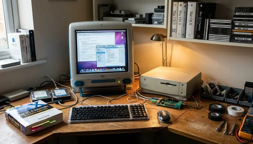
At a small desk near a window, the restored iMac wakes from sleep with the Dock sitting low and quiet on the glass shelf. Mail has its blue light beneath it. The Trash catches the corner of the eye. The wallpaper stays back, and the old icons do what they were drawn to do.






Discussion
Share your thoughts.
Write a Comment