What's Inside
- Why the Dock Still Defines a Vintage Mac Setup
- Criteria for Selection
- The Curated List: Classic Dock Customization Ideas
- Compatibility, Backups, and What Not to Modify
- Takeaways for a Coherent Vintage Dock
Why the Dock Still Defines a Vintage Mac Setup
The first thing I check on a restored Tiger, Leopard, Snow Leopard, or early Lion machine is not the wallpaper. It is the Dock.
That sounds minor until you sit in front of a 1024x768 iBook or a 1440x900 iMac and remember how much work the Dock carries. It is launcher, switcher, status strip, visual anchor, and, on a good vintage setup, the part of the desktop that makes the machine feel intentional rather than merely old.
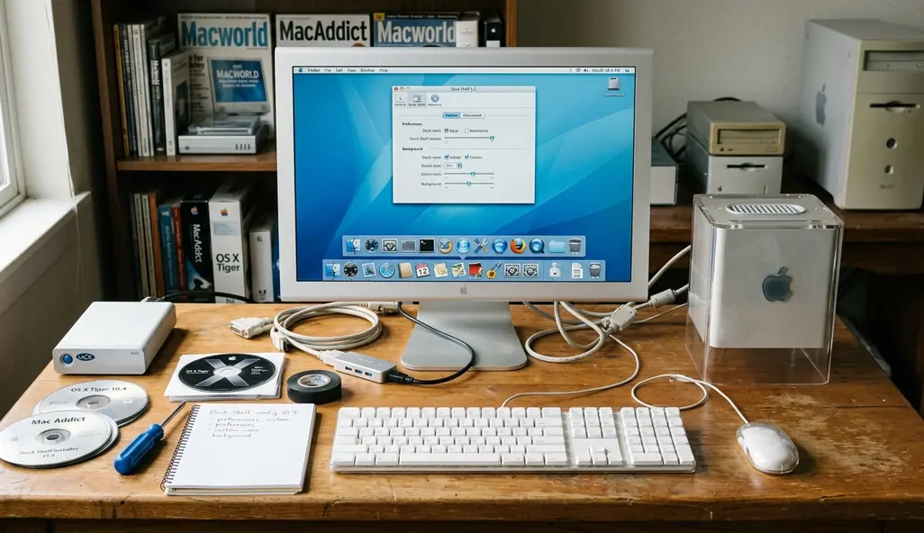
This list is not a nostalgia dump. The point is to keep the useful changes: tweaks that improve readability, reduce hunting, or restore a period-correct look without turning the system into a fragile museum piece. A Dock can look like 2007 and still help you work faster.
The scope here is deliberately narrow. I am focusing on reversible Dock tweaks, legacy utilities, icon sets, folder stacks, spacer tiles, and visual personalization. Full system theming, framework patching, and deep menu bar surgery belong in a different conversation because they change the risk profile.
Critical Insight: The best vintage Dock work is restrained. Choose changes that make daily use clearer before you chase every remembered effect.
Criteria for Selection
A useful Dock tweak has to pass three tests: it must look distinctive, work on real vintage hardware, and make sense on classic OS X without assuming modern macOS protections or current signing behavior.
The common question is simple: why not just install a full theme pack and be done with it? The detailed answer is less fun. During selection, full system theming tools were considered and then dropped because modifying core UI frameworks often leads to instability, including kernel panics on OS X 10.5. That is too much risk for a Dock article.
Testing covered PowerPC G4 and G5 systems as well as early Intel Core 2 Duo hardware. That range matters because a tweak that feels harmless on a later Intel Mac can behave differently on a PowerPC machine with limited graphics headroom.
The strongest candidates are user-level or easily reversible: Dock preference edits, backed-up icon swaps, spacer tiles, folder organization, magnification settings, and utility-based customization from the era. Legacy tools such as CandyBar 3.3.4 and LiteIcon can still be useful, but only when their installers, processor support, and target OS versions line up.
Period fit is the other filter. Aqua gloss, Brushed Metal, Leopard glass, graphite icon sets, translucent indicators, and early skeuomorphic cues all belong to recognizable visual eras. Mixing all of them at once usually makes the Dock look noisy.
Recommendation: Pick one era before changing anything: Tiger Aqua, Leopard glass, Snow Leopard graphite, or an early Lion transition look. The Dock will hold together better if every later choice respects that first decision.
The Curated List: Classic Dock Customization Ideas
1. Restore or Recreate the Leopard-Style Glass Shelf
The 3D Leopard shelf still earns its place on the right machine. On an aluminum iMac, white MacBook, or well-kept early Intel tower, it gives the Dock that reflective, staged quality people remember from the Leopard and Snow Leopard period.
It is not always the cleaner choice. On smaller displays, especially 1024x768 panels, the shelf can eat visual space and make icon labels feel crowded. A flatter 2D Dock along the left or right edge often reads better because it preserves vertical room and reduces reflections.
Position matters more than the tweak itself. A bottom Dock sells the shelf effect, but a side Dock can be more practical on widescreen 1440x900 displays. Icon size matters too: large icons feel period-correct, while slightly smaller icons keep utilities from becoming a row of polished marbles.
Field experience revealed one reliable pattern: when the Dock looks wrong, the problem is often scale, not style. Reduce the icon size first, then adjust magnification, then decide whether the shelf belongs.
2. Build a Period-Correct Icon Set
Beginners usually start by replacing everything. That is understandable, but it is also how a clean vintage desktop becomes inconsistent in an afternoon.
Start with high-visibility applications: browser, mail client, file manager, media player, image editor, terminal, and the utility folder. If those icons share a visual language, the Dock already feels composed. The remaining apps can wait.
Classic icon resources often come as.icns files containing variants from 16x16 through 128x128 pixels. That range matters because older OS X environments rely on multiple sizes as icons appear in the Dock, Finder, Get Info windows, and folder previews. A single oversized source image may look acceptable in one place and ragged everywhere else.
For Aqua-era setups, favor rounded, glossy application marks with strong silhouettes. For graphite or Brushed Metal machines, muted icons often sit better beside older Apple apps. Leopard-era icons can handle more depth and reflection, but they still need to agree with each other.
Recommendation: Replace only the icons you see every session, then run the machine for a day. If the Dock still feels uneven, the next problem will be obvious.
3. Add Spacer Tiles to Create Working Zones
Spacer tiles are one of the least glamorous Dock tweaks, and they are one of the most useful. A blank space between groups lets your eye find work zones without adding labels, extra folders, or visual clutter.
A simple arrangement works well: browsers first, creative apps next, utilities after that, then games or archive tools at the far end. The exact order is personal, but the zones should be stable. If the Dock changes every day, muscle memory never catches up.
The classic command for adding a blank spacer is still straightforward:
defaults write com.apple.dock persistent-apps -array-add '{"tile-type"="spacer-tile";}'After changing Dock preferences, restart the Dock process:
killall DockTo remove the spacer, drag it off the Dock like an unwanted app icon. That reversibility is why this tweak belongs near the top of the list.
Legacy OS X Dock Terminal Commands| Tweak | Terminal Command | Revert Command |
|---|---|---|
| Add Blank Spacer | defaults write com.apple.dock persistent-apps -array-add '{"tile-type"="spacer-tile";}' | Drag spacer off the Dock |
| Restart Dock After Preference Edits | killall Dock | The Dock relaunches automatically |
There is one advanced visual trick worth treating carefully: the hidden Suck minimize effect. It can feel wonderfully period-specific, but it relies heavily on Core Image hardware acceleration. On early iBooks with only 32MB of VRAM, it can cause severe UI stuttering. That is not character; that is the graphics subsystem asking for mercy.
Compatibility, Backups, and What Not to Modify
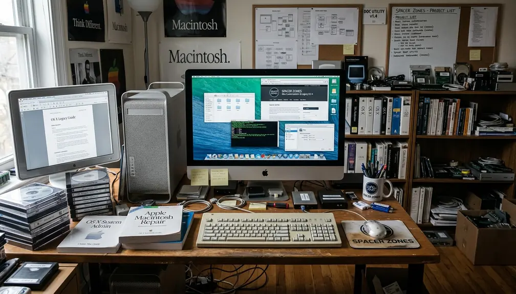
This guidance mainly targets OS X 10.4 through 10.8-era customization. Some ideas carry over to newer macOS versions, but behavior is not guaranteed, and modern Dock handling sits inside a different security and preference environment. For current basics, Apple maintains Apple's Dock basics for macOS.
Archived utilities need particular care. An installer may be unsigned, abandoned, PowerPC-only, Intel-only, or dependent on Rosetta. Universal Binaries can contain both PowerPC and Intel code forks, but that does not mean every helper tool inside the package behaves equally well on every machine.
For this narrow Dock-focused slice of legacy customization, safety improves when you treat downloads as artifacts rather than conveniences. Keep the installer. Keep checksums where available. Store a copy somewhere that is not the vintage Mac’s only working drive.
Risk Factor: Do not modify core UI frameworks just to make the Dock prettier. Outdated system theming tools have caused kernel panics on OS X 10.5, and the visual gain rarely justifies that level of repair work.
Backups should happen before the first icon swap. At minimum, copy ~/Library/Preferences/com.apple.dock.plist, any icon resources you plan to replace, and the user folders involved in stack organization. On working vintage systems, Time Machine, cloned drives, or disk images are better than trusting one aging disk.
Icon work deserves the same caution. If you replace an application icon, keep the original application bundle or resource file. If you use a utility, confirm that it can restore defaults before you let it touch a large set of apps.
- Back up ~/Library/Preferences/com.apple.dock.plist before editing Dock behavior.
- Save original.icns files before replacing icons.
- Use disk images or cloned drives when the machine still does real work.
- Avoid framework patchers unless you are prepared to restore the whole system.
- Restart the Dock with killall Dock after preference changes instead of rebooting for every small adjustment.
Takeaways for a Coherent Vintage Dock
A coherent vintage Dock does not need many tricks. It needs one visual era, a readable structure, and changes you can undo without reinstalling the operating system.
Start with icon consistency. Then add spacer tiles. Then tune size and magnification until the Dock feels comfortable on the actual display in front of you. Only after that should you consider deeper icon replacement or legacy customization utilities.
The practical order matters because each step gives you feedback. If a clean icon set and a few spacers solve the problem, stop there. A restrained Dock often feels more authentic than a machine overloaded with every tweak the era made possible.
Critical Insight: Favor reversible user-level changes over root-level modification. A vintage Mac should feel personal, but it should also boot cleanly tomorrow.


Discussion
Share your thoughts.
Write a Comment