Introduction: Four Looks, Four Different Mac Assumptions
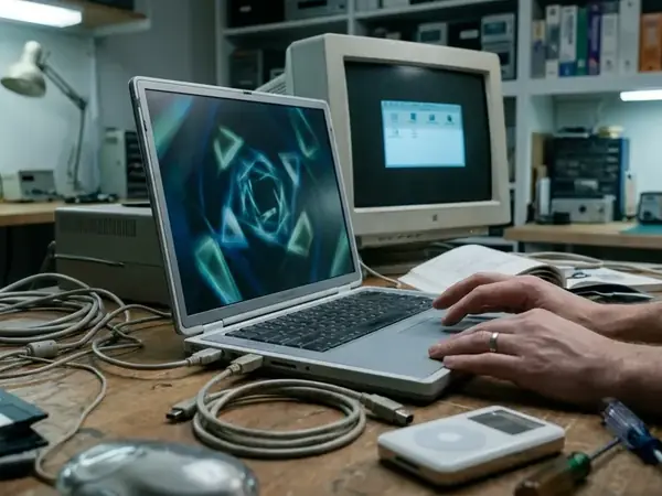
I still remember the exact moment I first booted up an iMac G4. The screen flared to life, and sitting at the bottom of the display was a row of icons that looked like you could reach out and grab them. Classic Mac icons are not only decoration—they dictate how older OS X desktops feel, scan, and age. When you restore or customize a legacy Mac today, the icons you choose fundamentally alter the machine's personality.
We can break the classic OS X visual landscape into four distinct languages: Aqua, Glass, Metallic, and Minimal. Each style carries different expectations about depth, shine, texture, and restraint. Aqua leans heavily into optimistic, gel-like realism. Glass pushes that realism into hyper-reflective territory. Metallic grounds the interface in heavy, industrial textures. Minimal strips the gloss away entirely.
This is not just an exercise in nostalgia. We need to evaluate each style as a working desktop choice. A beautiful icon that becomes an unrecognizable blur in a dense folder hierarchy fails its primary job. By understanding the mechanics behind these four styles, you can build a legacy desktop that is both historically evocative and highly functional.
How to Compare Classic Mac Icon Themes Without Flattening the Eras
People often ask how to objectively judge icon themes from an era defined by wild visual experimentation. When establishing the comparison criteria, we initially considered categorizing icons strictly by their legacy file formats, specifically comparing.icns files against.hqx archives. We rejected this approach because container types tell you nothing about usability. Instead, we must look at how the pixels actually perform on screen.
The true test of a classic Mac icon lies in its scalability. We evaluate legibility at 128x128 pixel Dock magnifications and clarity in dense 16x16 pixel Finder list views. An icon must maintain its silhouette across folders, applications, and varying background contrasts. It also needs to fit the specific OS X version you are running, from the pinstripes of early Aqua through the darker, unified look of Leopard-era desktops.
For a baseline standard, we look to Apple’s archived Human Interface Guidelines. This documentation outlines exactly how Mac interface design emphasized clarity, recognizability, and visual hierarchy. The guidelines explain why the same icon behaves differently depending on its context. A highly detailed 3D object might look stunning sitting alone on the desktop, but that same object can turn into visual noise when crammed into a narrow Finder column view.
Aqua Icons: Gloss, Depth, and the Signature Early OS X Mood
Aqua is the undisputed heavyweight of classic Mac design. These icons are defined by their gel-like surfaces, rounded forms, and highly saturated colors. They feature strong specular highlights that give them an optimistic, three-dimensional finish. This was the defining look of the 2001 to 2005 interface era.
The technical construction of Aqua icons was revolutionary for its time. Designers utilized 32-bit color depth combined with 8-bit alpha channels for drop shadows. This allowed the icons to cast soft, realistic shadows against any desktop wallpaper, grounding them in the virtual space. Aqua icons remain a solid choice for early OS X setups, especially if you are building a Jaguar, Panther, or Tiger-inspired machine.
From a usability standpoint, Aqua excels through strong object metaphors. A hard drive looks like a physical drive; a mail stamp looks like a real stamp. This high visual distinctiveness creates a satisfying Dock presence at medium and large sizes. Your eyes instantly recognize the shapes, making navigation fast and intuitive.
Glass Icons: Translucent Drama With a Narrower Sweet Spot
If Aqua is a polished gemstone, Glass is a freshly cleaned window. Glass themes act as an intensified cousin of Aqua. They feature clearer translucency, sharper specular highlights, and highly reflective edges. The goal is a more decorative, dramatic desktop effect.
From what we've seen, Glass themes appeal primarily to customization hobbyists. These users want a striking, showcase Dock rather than strict OS X authenticity. To achieve this look, designers often push center-fill opacity down to around 40% to simulate true transparency. The results can be visually stunning when paired with the right background.
Risk Factor: Glass icons carry significant practical risks. Because they rely so heavily on transparency, you will often see Glass icons losing edge definition against bright default desktop wallpapers. They also struggle against dark docks or cluttered desktop environments, where the background bleeds through and destroys the icon's silhouette.
Metallic Icons: Brushed Texture, Pro Apps, and Hardware-Era Cool
Metallic themes reject the candy-colored optimism of Aqua in favor of brushed surfaces, graphite tones, and hardware-like edges. This style draws heavily from the visual language of Power Mac systems and the pro application culture of the early 2000s. It is the signature pro-app aesthetic of the era.
This style connects directly to the broader Mac environment of the time. Think of the brushed-metal windows in early versions of Safari or iTunes, and the industrial design mood surrounding aluminum PowerBooks. Metallic icons offer restrained color palettes and strong compatibility with graphite-styled docks. They provide a mature, serious look for utility-heavy desktops.
However, the heavy reliance on gray tones and subtle textures introduces a specific usability flaw. You will frequently encounter Metallic folder icons becoming indistinguishable in dense 16x16 Finder list views. Without the bright color coding of Aqua, finding a specific folder in a long list requires reading the text rather than relying on quick visual scanning.
Minimal Icons: Cleaner Desktops, Less Period Flavor
Minimal themes are flatter, simpler, lower-detail alternatives. They intentionally reduce shine, texture, and object realism. Minimal themes strip away the heavy gloss of the early 2000s—a stark contrast to the default Aqua environment.
Many users run legacy Macs today as dedicated, offline machines. Minimal themes provide a good environment for distraction-free writing, browsing, or archival work. By removing the visual weight of 3D icons, the desktop feels quieter and more focused.
When you compare Minimal against Aqua and Glass, the trade-offs become clear. Minimal icons are often easier to scan in dense folder hierarchies because they rely on strong, simple shapes rather than complex textures. However, they are far less expressive. Using a Minimal theme often sacrifices the distinct, historical personality that makes classic OS X so enjoyable to use.
Scope, Compatibility, and the Limits of Theme Judging
Evaluating these themes requires balancing multiple authority signals. We look at Apple's original design guidance, the historical context of the OS X era, and practical legacy customization experience gathered through a multi-year archival project. However, icon theme behavior is highly dependent on your specific setup.
Your results will vary based on the OS X version, the specific icon resource format, your screen resolution, and your Dock magnification settings. It also matters whether you are replacing a few specific folders or applying a full system-wide set. While this evaluation relies on Apple's historical interface guidelines, individual monitor calibration and legacy graphics card rendering will alter how these specific transparency effects appear on your hardware.
Be cautious when downloading archived third-party icon packs. Many of these legacy files have incomplete size variations or inconsistent alpha masks. A practical limit here: mixing legacy 128x128 pixel assets with modern high-resolution icons will result in severe interpolation blurring when Dock magnification is pushed beyond 64 pixels. Always check the redistribution status and file integrity of older archives.
Which Classic Mac Icon Style Should You Use?
Choosing the right style depends entirely on what you want your legacy machine to do. To formulate the final recommendations, we mapped the four visual styles against three common legacy machine use cases: strict historical restoration, customized showcase displays, and daily-driver utility.
If you are building a period-correct early OS X machine, choose Aqua. It offers the most authentic character. If you are building a dramatic showcase machine and control the wallpaper carefully, Glass provides the most visual flair. For a utility-focused or pro-hardware mood, Metallic is the right choice. If you just want clarity and focus, go Minimal.
Critical Insight: Following these guidelines gives you a reliable baseline for a cohesive desktop. Do not mix styles. A Glass hard drive sitting next to a Minimal text editor creates visual friction that ruins the illusion of a unified operating system.
Recommendation: Never commit to a full system theme without testing first. Apply your chosen icons to a few test folders. View them in the Dock at maximum magnification, check them in the Finder icon view, and scrutinize them in a dense Finder list view. If they fail in any of those three contexts, find a different set.
Classic Desktop Icon Style Comparison| Style Family | Ideal Desktop Context | Dock Presence | 16x16 List View Legibility |
|---|---|---|---|
| Aqua | Period-accurate restorations | High impact, distinct silhouettes | Excellent |
| Glass | Showcase machines with dark wallpapers | Dramatic, highly reflective | Poor |
| Metallic | Utility and pro-hardware setups | Restrained, mature | Fair |
| Minimal | Distraction-free legacy machines | Flat, low-detail | Good |


Discussion
Share your thoughts.
Write a Comment