
What's Inside
- Disk Icons Set the Theme Before Anything
- Why Volumes Become the Desktop’s Visual Anchors
- One Icon Family Can Explain the Whole Machine
- What Makes a Disk Icon Feel Native to Its Era
- The Appeal of a Change You Can Easily Undo
- A One-Icon Makeover for an Unfinished Desktop
Disk Icons Set the Theme Before Anything
Mismatched disk icons leave an otherwise polished vintage Mac desktop feeling unfinished. Coordinated volumes establish the theme immediately upon boot. Persistent, functional desktop objects contribute more identity than larger but less frequently seen changes. Hard drives, external disks, partitions, removable media, and other mounted volumes visible in the Finder form the core of this visual identity.
Standard system icons disrupt custom themes more than default fonts do—desktop screenshots from vintage setups tend to bear this out. A heavily customized interface with a glaring default hard drive icon breaks the illusion of a cohesive environment. Modifying the startup disk first yields the most immediate visual upgrade. Users often spend hours tweaking window borders and scrollbars while ignoring the one element that sits permanently in the top right corner of their screen.
Why Volumes Become the Desktop’s Visual Anchors
The startup disk occupies a stable Finder position. It becomes a recurring point of orientation each time the desktop appears. Wallpapers, menu-bar modifications, application skins, and screensavers frequently disappear behind active windows. They might only appear in particular contexts or specific applications. The startup disk remains visible.
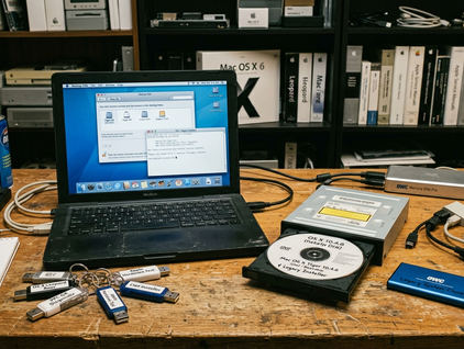
Repetition strengthens the effect across the entire system. An internal drive, archive partition, external disk, and mounted image create a recognizable visual family. Compared to static background elements, the startup disk receives the highest frequency of drag-and-drop actions. This interaction frequency cements its importance in the daily workflow.
The available canvas size dictates the detail level available to the designer. A 32x32 pixel grid defines classic Mac OS icons, forcing strict economy in pixel placement. A 128x128 pixel maximum applies to early OS X releases, allowing for photorealistic textures and complex shading. Designing for these specific constraints ensures the icon reads clearly at a glance.
One Icon Family Can Explain the Whole Machine
A dependable method for building a cohesive desktop requires a useful hierarchy. The startup disk serves as the primary emblem. External drives act as related variants. Archive volumes take on subdued versions. Removable media remain clearly distinct from permanent storage.
Assigning the most detailed icon to the startup disk and simplified variants to external storage creates a logical structure. Consistent silhouette, perspective, color depth, and highlight treatment unify volumes without making them indistinguishable. A user should instantly recognize a FireWire drive versus an internal partition based on subtle color shifts or badge additions.
Period fit across broad visual eras matters immensely. Platinum-gray classic Mac styling demands flat, precise pixel art with sharp black outlines. Translucent early OS X aesthetics require depth, gloss, and vibrant candy colors. Brushed-metal or glossy Aqua treatments rely on heavy textures and dramatic lighting. Mixing a flat System 7 icon with a photorealistic OS X 10.2 folder creates visual friction.
What Makes a Disk Icon Feel Native to Its Era
A practical evaluation checklist ensures an icon fits its environment. Review the viewing angle, edge sharpness, palette, material cues, shadow style, transparency, and legibility at normal Finder sizes. Judge a disk icon on the actual desktop rather than only as enlarged artwork in an image editor. Subtle labels and fine details collapse at smaller sizes, rendering complex designs muddy.
Test candidate icons by placing them on a neutral gray background and a complex patterned wallpaper. This verifies that the alpha channel masking does not create jagged white halos around the edges. Transparency handling evolved significantly across operating system generations. Pre-OS 8.5 systems rely on 1-bit transparency masks, meaning a pixel is either fully opaque or fully transparent. Later versions introduced 8-bit alpha channels for smoother drop shadows and anti-aliased edges.
Alpha channel rendering differences between Mac OS 9 and Mac OS X 10.2 require careful testing across dual-boot systems. An icon that casts a perfect soft shadow in OS X might display a harsh, solid black border when booted into OS 9. While these visual guidelines do help with desktop cohesion, icon rendering behavior remains strictly bound by the specific OS version's display server limitations.
Network Share ReversionsCustom icons pasted onto mounted network shares frequently revert to the default generic server icon upon the next connection, depending on the host protocol.
The Appeal of a Change You Can Easily Undo
The familiar Finder workflow operates at a simple conceptual level. Prepare a compatible source icon. Open Get Info for the source and destination. Select the icon thumbnail in the top left corner. Copy and paste the custom artwork. Documenting the standard Get Info copy-paste method exclusively prioritizes native OS capabilities over requiring users to install legacy resource-editing utilities.
The common reversal pattern involves selecting the custom icon in Get Info and deleting it to restore the default system graphic. Behavior and permissions vary by system version, disk format, and volume ownership. The system generates an invisible file named 'Icon\r' at the root level of the volume to store this custom image data.
Preserve the source artwork and record which icon belongs to each volume before making a coordinated set. Resource fork stripping occurs when transferring classic Mac icons over FAT32 formatted drives. The custom icon data lives in the resource fork, which FAT32 does not support, resulting in a blank or generic file upon transfer. Archive icons in compressed formats like StuffIt or ZIP before moving them across modern file systems or network boundaries.
A One-Icon Makeover for an Unfinished Desktop
A graphite or early Aqua desktop often features matching wallpapers, Dock styles, and folder icons. A generic startup disk disrupts this visual language entirely. Curating a specific graphite-themed icon replacement involves matching the exact highlight gradient and drop-shadow angle of the default early OS X interface elements.
Select a disk icon with the same perspective, restrained palette, and highlight treatment as the existing interface. Changing only the startup disk creates a focal point without requiring a new theme package, system extension, or permanent modification. Open the Get Info panel for your chosen replacement graphic right now, copy the thumbnail, and paste it onto your main Macintosh HD volume to instantly anchor your desktop's aesthetic.







Discussion
Share your thoughts.
Write a Comment