
Four Small Widgets, One Larger Idea
A calculator, a clock, a unit converter, and a single-purpose utility. These four familiar forms defined the early Mac OS X Dashboard experience. Developers determined the scope of early widgets by isolating a single daily action. They stripped away all secondary menus to force immediate usability. The value of Dashboard came from making narrowly scoped ideas immediately accessible on a Mac desktop.
Think of it as a workshop. It provided a space for testing, adapting, and discarding small tools. Typical early widget bundles remained under 250KB in size. Canvas footprints rarely exceeded 300 by 300 pixels. This tight constraint forced focus. You built a tool to do one thing well.
The workshop metaphor helps explain why the platform thrived initially. A developer could sketch out an idea on a Tuesday and have a working prototype on a Wednesday. The environment encouraged disposable software. If a widget proved useful, it stayed on the screen. If it failed to solve a problem, the user deleted it without a second thought.
Small constraints breed creative solutions. By limiting the available real estate, the operating system forced creators to prioritize function over feature bloat. A calculator widget only needed a number pad and a display screen. Adding a history log or graphing capabilities would violate the core design philosophy.
A Mac Workshop Built from Web Parts
How did Apple encourage this rapid experimentation? The platform creator opted to route widget rendering through the system's built-in web engine rather than requiring compiled code. This decision lowered the conceptual barrier between an idea and a functioning desktop utility. Early internal discussions considered offering a stripped-down native environment. In the end, building on existing web standards was the faster path.
A basic HTML and CSS snippet could be wrapped into a functional .wdgt bundle in roughly 15 to 45 minutes. The structure required only three core files: an HTML document, a Default.png background image, and an Info.plist configuration file. This created a highly compact development loop. You define one task, build a small interface, test it in Dashboard, and revise without designing a full application.
Anyone curious about the exact mechanics can review Apple's archived Dashboard Programming Topics. The documentation outlines how standard web standards translated directly into desktop accessories.
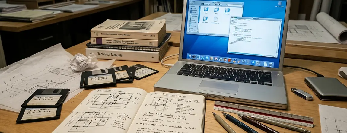
This architecture meant that anyone with basic web design experience could suddenly build Mac software. The learning curve flattened significantly. A designer who knew how to style a webpage could now style a desktop tool. The underlying logic relied on JavaScript, a language already familiar to thousands of web developers.
Why Clocks, Calculators, and Converters Belonged There
Consider the jobs these tools performed. Clocks expose information at a glance. Calculators accept a brief input. Converters return one focused result. Limited screen space encouraged concise controls and legible states.
Designers selected heavy skeuomorphic textures like stitched leather or brushed metal. This instantly communicated the tool's physical real-world counterpart without requiring a manual. Targeted at the standard 1024x768 displays of the era, these interfaces needed to be instantly recognizable. Interaction times were designed to last roughly three to eight seconds per activation.
Compare this to launching a full application. Opening a heavy program for a three-second calculation disrupts your workflow. Dashboard kept the interruption brief.
Designing for the Glance
When building for a three-second interaction window, every pixel must serve a clear purpose. Heavy textures and realistic shadows helped users instantly identify the interactive elements on the screen.
The visual language of the era heavily favored realism. A sticky note widget looked exactly like a yellow piece of paper. A calendar widget featured a spiral binding. These design choices grounded the digital tools in physical reality, making them approachable for users of all skill levels.
The App-Platform Test Was Too Heavy for Dashboard
Users often applied the expectations of long-term applications to these small utilities. Broad workflows, regular maintenance, compatibility work, documentation, and dependable support define standard software. Those standards obscure the value of a successful experiment that solved one problem or explored one interface idea.
The workshop model had genuine weaknesses. Many third-party API feeds originally used by these tools were deprecated over the years around 2010. Widgets relying on undocumented XML feeds fail silently when the host server returns a 404 error.
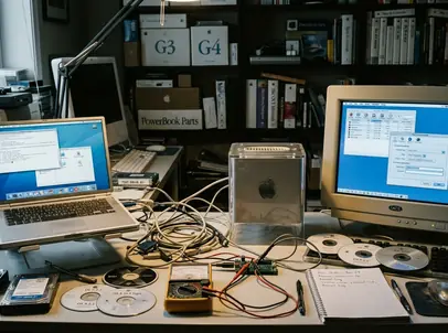
Archivists evaluating abandoned widgets prioritize extracting the interface assets and property lists over attempting to rewrite broken network calls. They treat the bundle as a historical design document. Preserving the visual interface of a widget does not guarantee its underlying network requests can be simulated or bypassed on modern networks. Legacy environments from the mid-2000s are typically required for accurate rendering. Visual rendering discrepancies occur where CSS opacity rules behave differently depending on the specific legacy OS version used for testing.
The expectation of perpetual updates ultimately doomed many excellent widgets. A developer might build a perfect tool for tracking packages in 2006. By 2010, the shipping company changes its API, and the widget breaks. The developer, having moved on to other projects, abandons the tool. The user perceives this as a failure of the platform, rather than the natural lifecycle of a small, single-purpose utility.
Judge the Widget by One Small Job
When testing vintage widgets, hobbyists establish a baseline by first isolating the primary input field or toggle. They ignore broken external links to focus solely on whether the core local calculation functions. Testing sequences typically involve mounting a legacy operating system virtual machine allocated with 512MB to 1GB of RAM. Evaluation logs record the specific web rendering engine quirks present in 2005-2009 era operating systems.
Preserve the widget package, version information, visible states, and a short account of its original purpose. Measure the tool against its original intent rather than current Mac software standards. Dashboard served as a proven bench for compact ideas. Usefulness could be brief, personal, and narrowly defined.
The true legacy of Dashboard lies in its role as a proving ground. It allowed developers to test interface concepts that later found their way into mobile operating systems and modern notification centers. The widgets themselves may have degraded, but the ideas they introduced remain relevant.
The virtual machine boots into Mac OS X Tiger, the fan noise of the host machine humming quietly. A press of the F12 key slides the desktop away, revealing a dim background populated by a single, stitched-leather unit converter. The cursor clicks the brushed metal toggle, the conversion from ounces to grams calculates instantly, and another press of F12 returns the screen to a modern workflow.





Discussion
Share your thoughts.
Write a Comment